Behind the design
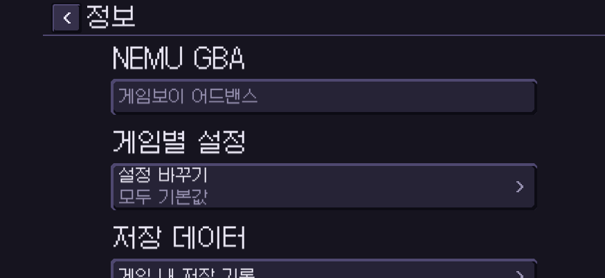
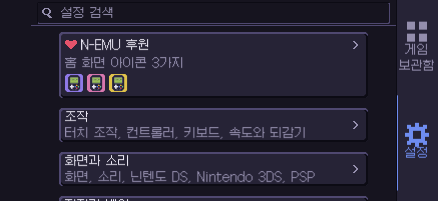
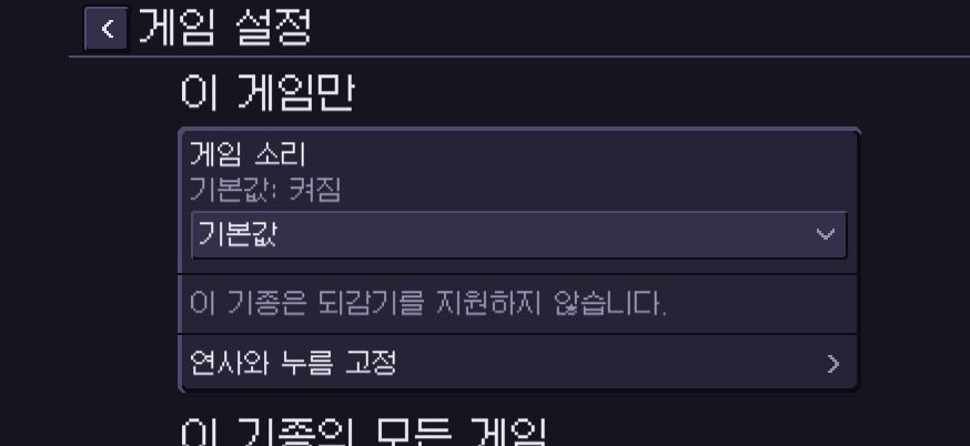
Pixel design inspired by old consoles and dial-up bulletin boards.
Angular corners and light and dark borders give the buttons depth.
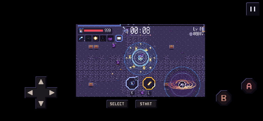
A dark background keeps the game in focus. The app and site share colors and icons, and their Korean screens use the same pixel font.
App screens
Phone
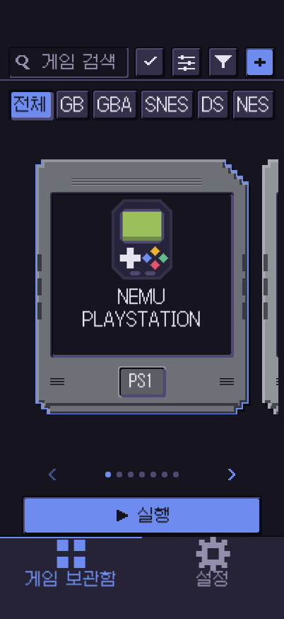
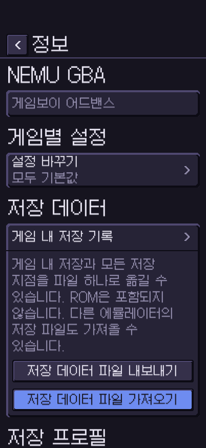
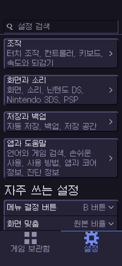
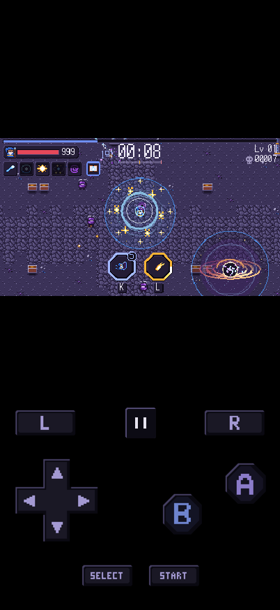
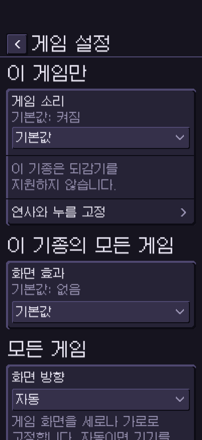
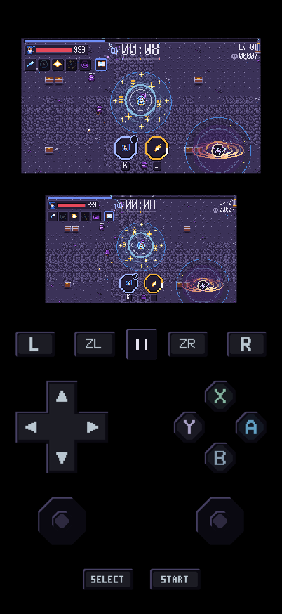
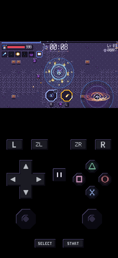
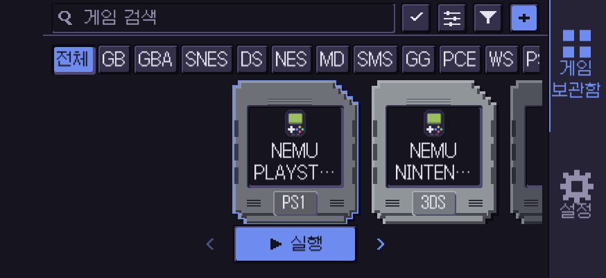
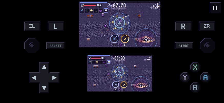
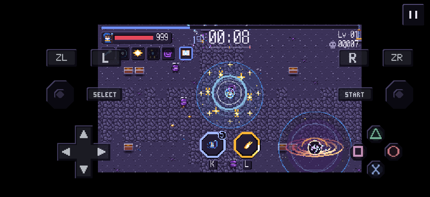
iPhone Duo
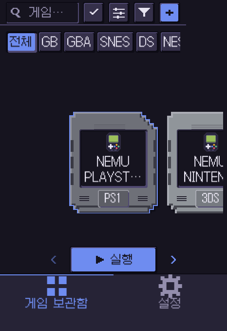
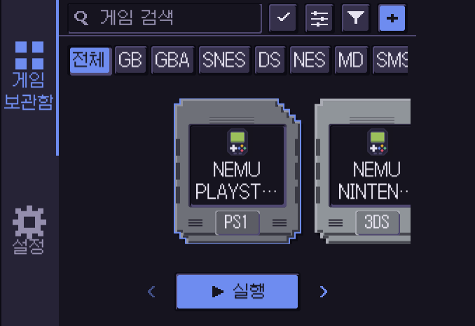
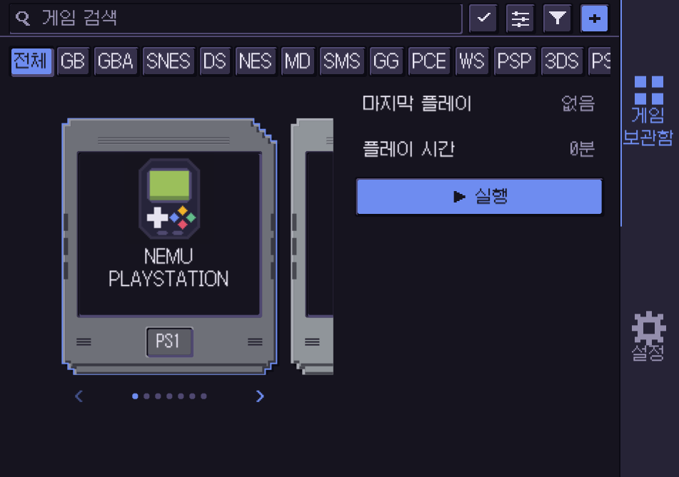
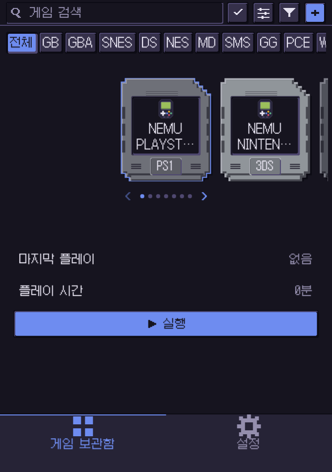
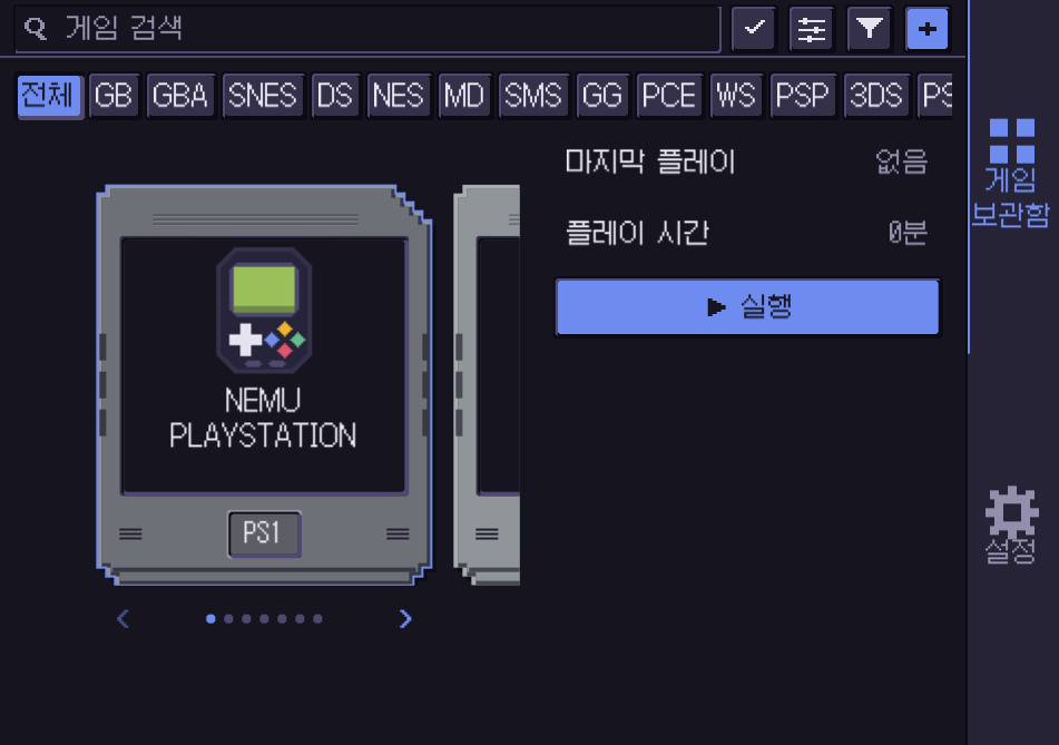
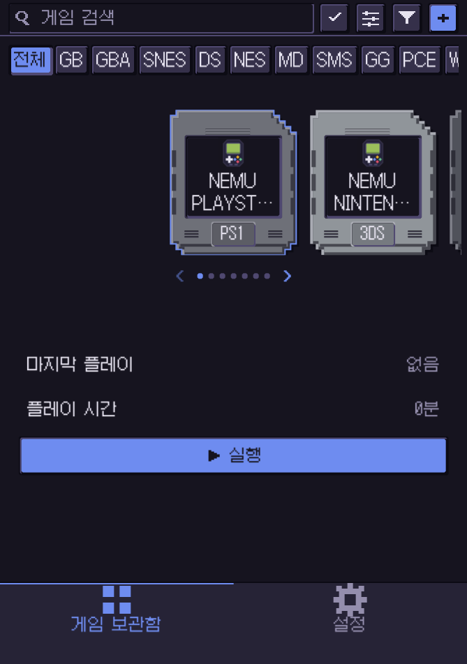
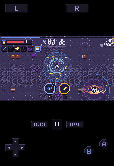
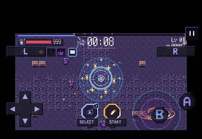
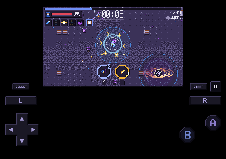
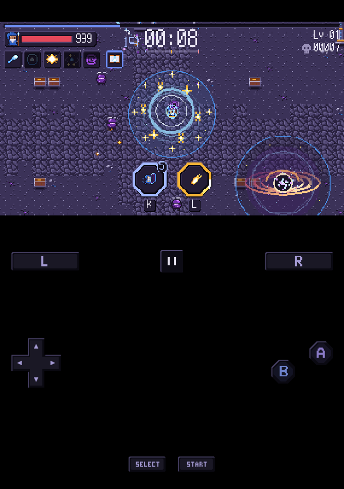
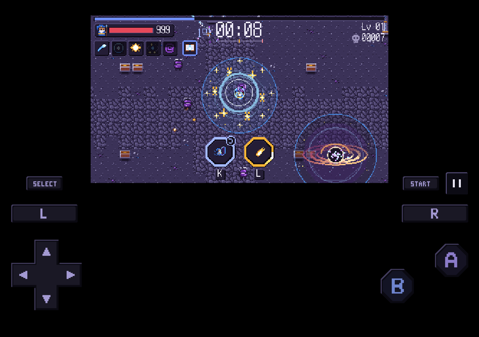
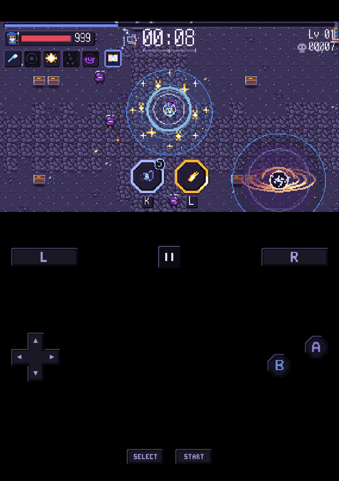
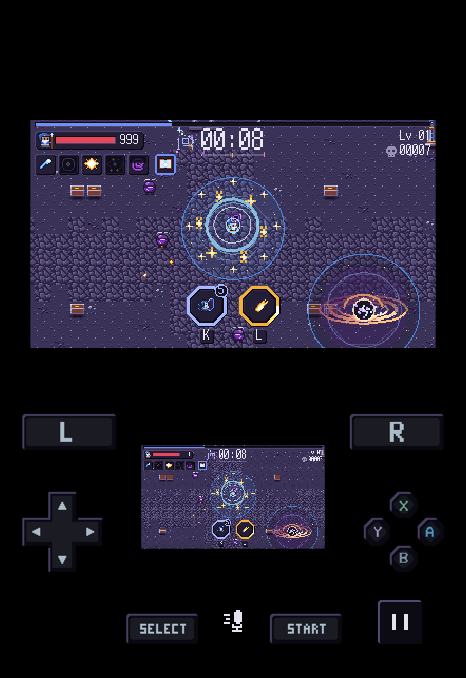
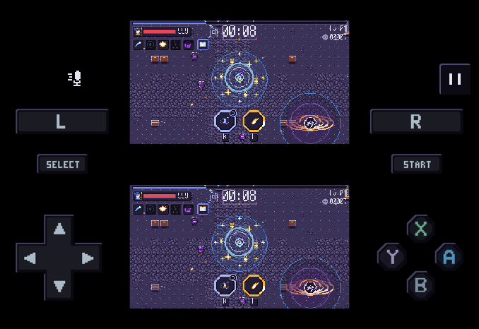
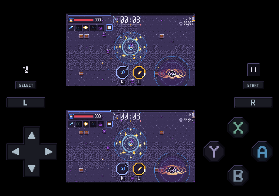
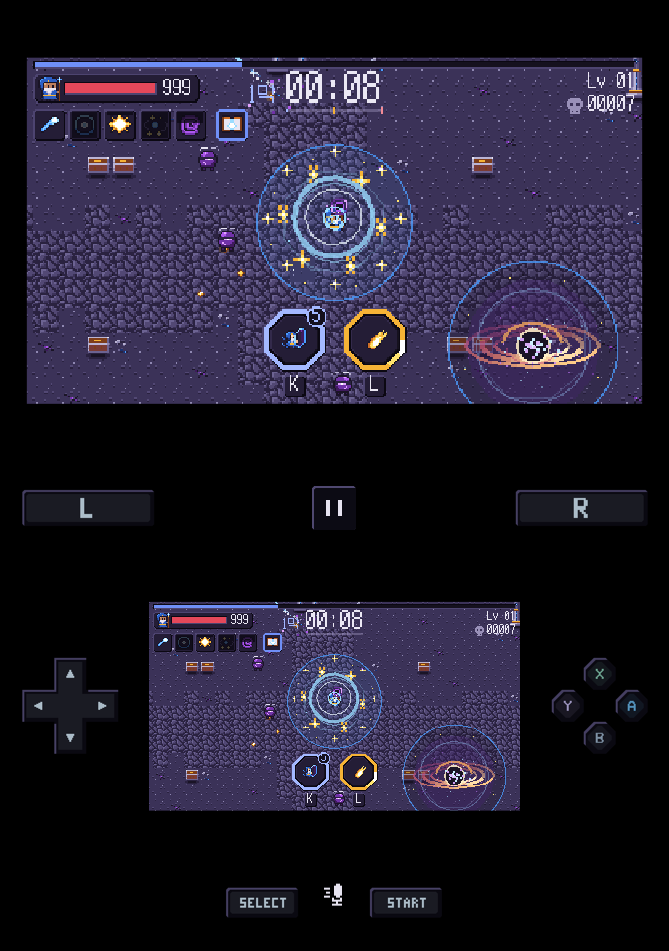
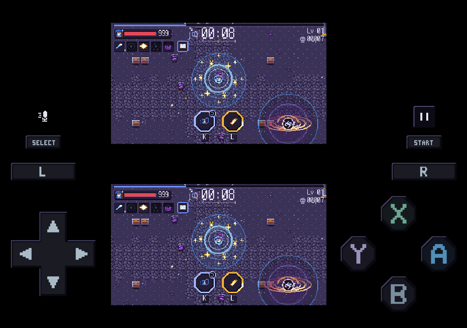
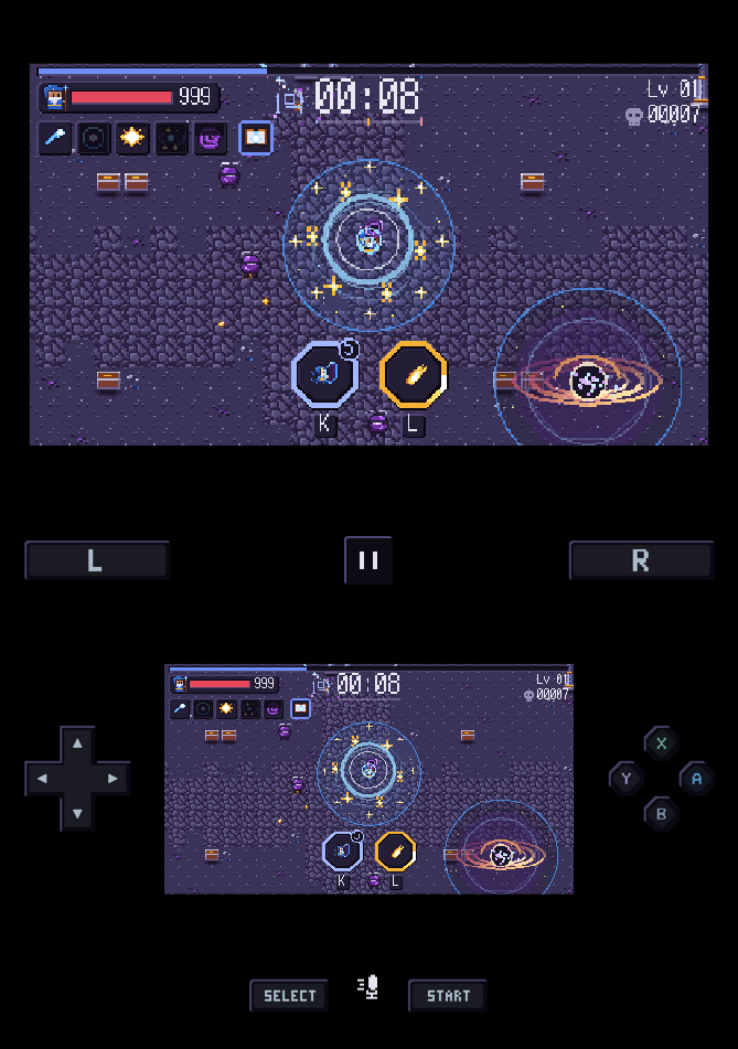
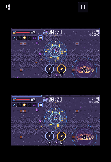
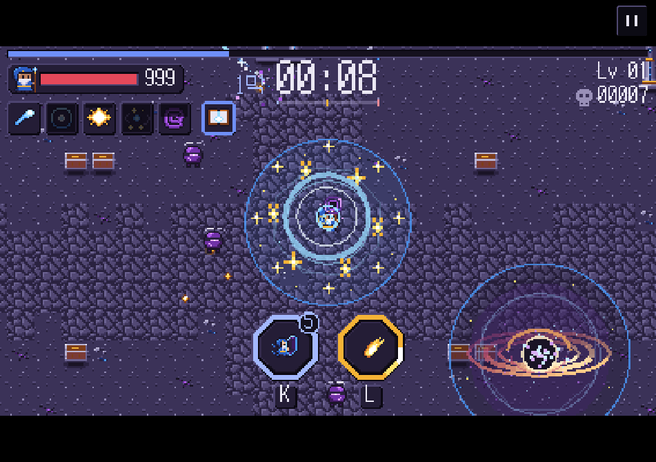
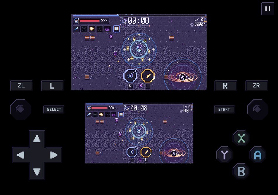
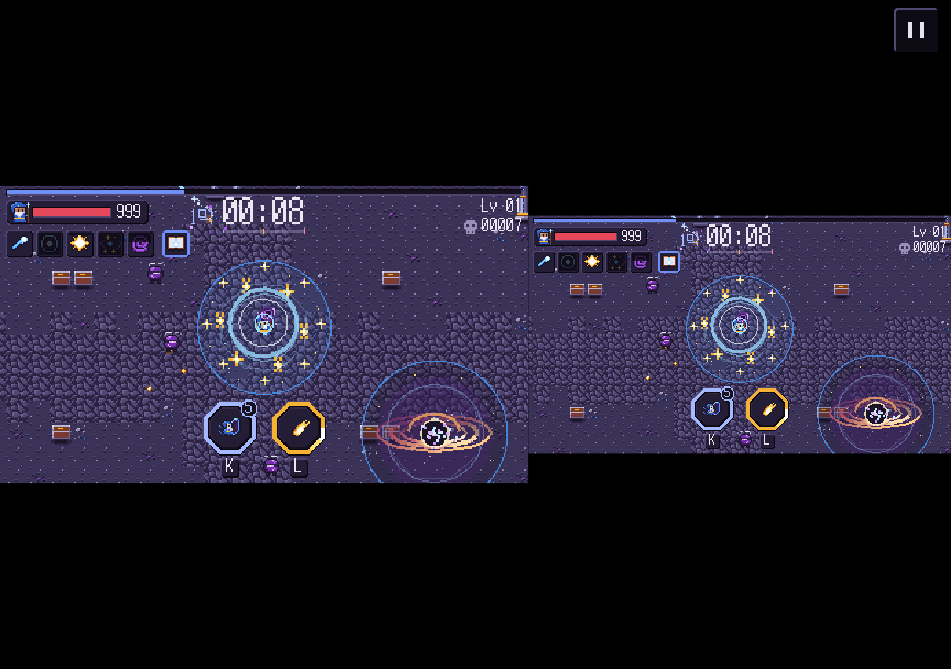
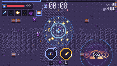
Previews of app 1.10.1, rendered for each device size and fold direction. The game scene is illustrative.
Loading screen
> Preparing your library…
When progress cannot be measured, the moving bar shows that work is still in progress.
Pixel fonts
Korean text uses the Galmuri pixel font. Type sizes follow a 12-pixel scale to keep the glyphs crisp.
48 · Large heading
36 · Subheading
24 · Body text
12 · Supporting text · monospace
Icons
Icons drawn on a 12×12 grid, shared by the app and this site.
LibrarySettingsCartridgeAddClosePauseBlowStartFast-forwardSaveLoadDeleteFavoriteSupportSearchSelectPreviousNextOpen listDisplay optionsGame groupsTagsDrive backupMore
App accessibility
- · High contrast mode makes supporting text and on-screen buttons easier to see.
- · Respects your device's reduced-motion setting.
- · Selected items are marked with both a check and a bar.
- · VoiceOver and TalkBack can read button and menu names.
- · The app does not currently follow the system text-size setting.